How to Create an Indigenous-Inspired Logo
A Saskatchewan artist is honouring the Saskatchewan Roughriders’ recent Grey Cup victory with a powerful new Indigenous-inspired tribute logo. The artwork, created by illustrator Chris Chipak of the Red Pheasant Cree Nation, celebrates the team’s 25–17 win over the Montreal Alouettes — their first championship since 2013.
Chipak, who became widely recognized last season for designing an Indigenous Roughriders logo featuring a buffalo, river and sun, said the idea for the new championship design came to him while watching the Grey Cup game. He noticed fans in the stadium wearing his earlier logo.
“It kind of hit me… seeing people in the crowd wearing the colours that I put as the logo,” Chipak said. “The amazing part is, I get to have that every time I watch the game.”
A Design Rich in Symbolism
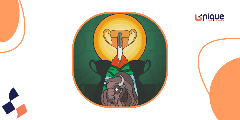
The new artwork places the Grey Cup trophy at the center, with silhouettes of the team’s previous four Grey Cup victories behind it. A single feather rises from the trophy, illuminated by the sun — symbolizing connection, honour, and the spirit of the Prairies.
At the base of the design is a buffalo, its mane transforming into roots spreading across the ground. The buffalo represents strength and identity, while the roots symbolize grounding, heritage, and the deep connection between the Riders, Indigenous communities, and fans across Saskatchewan.
Part of the Team’s Reconciliation Efforts
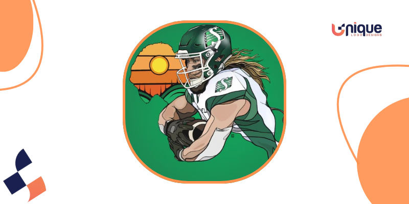
Chipak first partnered with the Roughriders as part of their Truth and Reconciliation initiative. His earlier Indigenous logo incorporated the buffalo, a flowing river, prairie symbolism, and two feathers representing respect, bravery, and Two-Spirit identities.
A full-colour version of that logo, released this year, became extremely popular among fans. Each colour carries meaning:
- Green for grass
- Blue for water
- Yellow for the sun and Treaty promises
- Brown for the buffalo and the land
- Grey for resilience and the past
- Orange for healing and remembrance
Some revenue from merchandise sales also supports Indigenous initiatives in Saskatchewan.
Celebrating Community Pride
Chipak said that watching Indigenous families embrace the logo has been one of the most rewarding aspects of his work.
“It’s more so that it’s their logo,” he said. “If they’re getting it, they’re getting it for auntie, grandma, niece, nephew, brother, sister… It’s a rewarding feeling knowing they stand behind it.”
He hopes the new Grey Cup tribute design becomes a lasting reminder of the Riders’ historic win — and a symbol of how sport brings people together across the province.
Credit
Video credit and artwork credit: Chris Chipak, Red Pheasant Cree Nation.
Disclaimer
This article includes information and descriptions based on videos, interviews, and publicly available sources.