The Arizona Coyotes have revived one of the most recognizable designs in hockey by bringing back their original black Kachina jerseys for select home games. The team announced that the classic uniforms will be worn during 14 home games, including all Saturday matchups at Gila River Arena.
The return of the Kachina jersey has generated excitement among longtime fans who remember the distinctive design from the late 1990s. The unique look first appeared during the 1996–97 NHL season, shortly after the franchise relocated from Winnipeg to Phoenix.
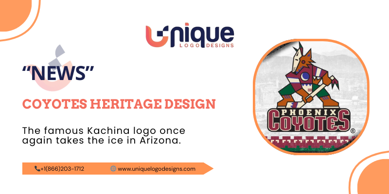
A Logo That Stood Out in the NHL
When the Coyotes introduced their original logo, it immediately stood apart from other NHL designs. The artwork featured a Kachina-style coyote standing upright while holding a hockey stick, inspired by Southwestern art and culture.
The logo was created by the Phoenix-based design firm Campbell Fisher Ditko. Instead of using the traditional aggressive animal style commonly seen in sports branding, the designers aimed to create a concept that blended hockey with the cultural identity of the American Southwest.
The color palette included forest green, brick red, sand, sienna, and purple, making the uniform one of the most visually complex and colorful designs in the league at the time.
David Haney, who served as the NHL’s creative director during that period, once described the design as a bold and unconventional interpretation of hockey branding. According to Haney, the logo successfully combined sports imagery with regional artistic influence, making it both intriguing and memorable.
Hidden Details in the Design
Designer Greg Fisher explained that the logo contains several small details that many fans may overlook. One interesting feature is that the words “Phoenix Coyotes” are hidden within the shape of a hockey puck integrated into the artwork.
Fisher said the goal was to ensure that fans could immediately recognize the team as representing Arizona. At the same time, the design intentionally avoided the typical “angry animal” sports logo style that dominated professional leagues.
Creating the final logo involved significant collaboration between the design firm, team ownership, and the NHL. Discussions focused on the color scheme, shapes, and typography to ensure the design captured both hockey culture and the region’s artistic heritage.
Fans Celebrate the Nostalgic Return
Throwback uniforms have become increasingly popular across professional sports leagues. For the Coyotes, the return of the Kachina jersey holds special significance because of its strong connection to the team’s early years in Arizona.
The franchise previously reintroduced the jersey during a special Throwback Night event, which received an overwhelmingly positive reaction from fans. Many supporters consider the Kachina logo to be one of the most unique identities ever created in the NHL.
Fisher noted that nostalgia plays a major role in sports culture. Throwback nights allow fans to reconnect with the history of their favorite teams and celebrate memorable moments tied to iconic uniforms and logos.
A Lasting Symbol of Coyote’s History
Even decades after its debut, the Kachina logo remains an important part of the Coyotes’ identity. Its artistic complexity and cultural inspiration helped it stand apart from traditional sports logos.
For many fans, the design represents more than just a jersey. It symbolizes the moment the franchise arrived in the Southwest and began building a unique identity within the NHL.
With the return of the classic uniforms, supporters will once again see a piece of hockey history on the ice. The Kachina logo continues to hold a special place in the franchise’s legacy and remains one of the most beloved designs in the team’s history.
Disclaimer:
This article is published for informational and news purposes. Some details are based on historical reports, team announcements, and publicly available sources. Any referenced video or media content belongs to its respective creator.