Everything You Need to Know to Build a Fitness Brand Logo That Attracts and Motivates
Walk into any gym, and you will notice something immediately. The best ones feel like a brand. The logo on the wall, the colors on the equipment, the typography on the signage, all of it communicates a specific energy before a single workout begins.
That is not accidental. It is the result of intentional gym logo design that understands what fitness customers respond to and what makes them feel like they belong somewhere.
Whether you are launching a new gym, a personal training business, a boutique fitness studio, or a sports apparel brand, your logo is the first physical and psychological signal your brand sends to the people you want to attract.
In this guide, you will learn:
- What makes a gym and fitness logo genuinely effective
- How to match your logo style to your fitness concept
- The role of color, typography, and symbolism in fitness branding
- The mistakes that weaken fitness logos and how to avoid them
Ready to Launch Your Gym Brand?
Work with professional logo designers to create a high-energy fitness logo that captures your vision and attracts your ideal audience.
Why Gym Logo Design Is Different from Other Industries
Fitness is an emotionally charged industry. People do not just choose a gym for the equipment. They choose it for how it makes them feel. Motivated, powerful, confident, part of a community, or committed to a version of themselves they are working toward.
Your gym logo design needs to trigger those feelings instantly. It needs to communicate energy, credibility, and a sense of belonging to your specific fitness tribe before a potential member has ever stepped inside.
A weak or generic fitness logo communicates the opposite. It signals that the brand does not understand what its members are looking for, which is one of the fastest ways to lose them to a competitor that does.
How strategic logo design drives business growth in competitive markets is explored here: Beyond Aesthetics: How a Strategic Logo Drives Business Growth.
Defining Your Fitness Brand Before Designing Your Gym Logo
Defining your fitness brand’s mission and target audience is essential before making any design decisions.
Answer these questions before briefing a designer:
What type of fitness business are you?
Large commercial gym, boutique studio, CrossFit box, yoga and wellness center, personal training practice, martial arts school, sports performance facility, or online fitness brand. Each of these has a distinct visual language.
Who is your target member or client?
Serious athletes, everyday fitness beginners, weight loss-focused individuals, competitive sports performers, wellness-oriented professionals, or a community of a specific demographic. Your gym logo design needs to speak directly to them.
What is the atmosphere of your space or brand?
Hardcore and intense, welcoming and inclusive, clean and clinical, spiritual and mindful, or fun and social. This atmosphere should be immediately communicated by your logo.
What values define your brand?
Strength, transformation, community, discipline, wellness, performance, or longevity. Every element of your fitness brand logo should reinforce these values.
How brand personality shapes logo design decisions is explored here: brand personality and emotional branding in logo design
Logo Styles That Work in Gym and Fitness Branding
Different fitness concepts call for different visual approaches. Here is a breakdown of what works and why.
Bold Wordmarks
A strong wordmark uses the gym or brand name in a powerful, custom typeface as the entire logo. This approach works particularly well for fitness brands with short, punchy names that carry natural energy.
Bold condensed typography, sharp angles, and strong letter spacing can turn a name into a visual statement without the need for any additional iconography.
Combination Marks
A combination mark pairs a visual symbol with the brand name. This is one of the most versatile approaches in gym logo design because it gives you a full logo for signage, apparel, and marketing, plus a standalone icon for smaller applications like app icons, social media profiles, and embroidery.
Abstract and Geometric Marks
Clean geometric shapes and abstract marks communicate precision, power, and modernity. They work well for performance-focused gyms, sports science facilities, and fitness technology brands where the visual identity needs to feel cutting-edge.
Mascots and Character Marks
Character-based logos work particularly well for sports teams, martial arts schools, youth fitness programs, and any fitness brand where community identity and team spirit are central to the experience.
How different logo types work for different brand personalities is explored here: The Ultimate Guide to Choosing the Right Logo Type for Your Small Business.
Color Psychology in Gym Logo Design
Color is one of the most powerful tools in fitness branding. The right color choices do not just look good. They trigger specific emotional and physiological responses that align with what your members are looking for.
Black is the dominant color in serious, high-performance gym branding. It communicates power, discipline, exclusivity, and intensity. Black-based fitness brand logos signal that the brand is for people who are serious about their training.
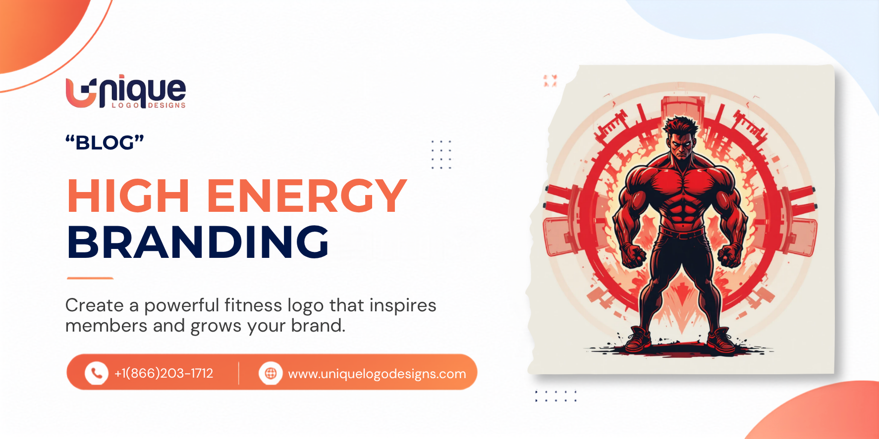
Red creates urgency, energy, and physiological arousal. Research shows that red actually increases heart rate and adrenaline, making it a naturally aligned color for high-intensity training brands, boxing gyms, and competitive fitness concepts.
Orange communicates energy, enthusiasm, and motivation without the aggression of red. It works well for group fitness studios, functional training gyms, and brands that want to project intensity with an approachable edge.
Yellow signals optimism, positivity, and high energy. It is commonly used by fitness brands targeting beginners, wellness-focused communities, and group exercise concepts where fun is part of the promise.
Blue communicates trust, reliability, and calm focus. It works well for sports performance centers, swimming and aquatic brands, and wellness-oriented fitness concepts where mental clarity is as important as physical performance.
Green signals health, vitality, and natural energy. It is a strong choice for yoga studios, wellness centers, outdoor fitness brands, and any concept where holistic health is the core positioning.
White communicates cleanliness, clarity, and premium quality. Often used as a secondary color against darker backgrounds, white creates contrast and projects a sense of professional precision.
The full science of color psychology in logo design is here: color psychology in logo design.
Typography in Fitness Brand Logos
Typography is one of the most underestimated tools in gym logo design. The font in your fitness brand logo communicates attitude and energy before a member reads a single word.
Condensed and bold sans-serif fonts are the most common choice in fitness branding because they communicate strength, power, and forward momentum. Their vertical proportions create a sense of height and intensity.
Geometric sans-serif fonts feel precise, modern, and performance-oriented. They suit sports science facilities, fitness technology brands, and any concept built around data and measurable results.
Slab serif fonts communicate solidity, reliability, and established authority. They work well for traditional gyms, boxing clubs, and strength training facilities where the heritage of the sport is part of the identity.
Italicized and angular typography communicates speed and dynamism. The forward lean of italic letterforms creates a sense of motion that is well-suited to running clubs, cycling brands, and high-speed sports concepts.
Script and handwritten elements work specifically for yoga studios, wellness brands, and boutique fitness concepts where warmth and personal connection are central to the brand experience.
How typography shapes brand perception across industries is explored in depth here: the power of typography in branding.
Symbolism and Iconography in Gym Logos
The visual symbols used in fitness brand logos carry specific meanings that reinforce your brand positioning.
Abstract human forms in motion communicate athleticism, dynamism, and transformation. When executed well, they are among the most versatile symbols in fitness branding.
Geometric shapes with angular energy, such as lightning bolts, chevrons, arrows, and sharp angles, communicate speed, power, and forward movement.
Animal imagery is powerful in fitness branding because animals carry strong symbolic associations. Lions and eagles project strength and leadership. Wolves communicate pack mentality and team spirit. Bulls signal raw power and aggression.
Letters and initials with embedded symbols are a sophisticated approach that combines a wordmark or lettermark with an icon. A well-designed letter with a hidden athletic symbol creates memorability and rewards attention.
Whatever symbol or icon is used, originality is critical. Generic dumbbell icons, stick figure athletes, and flame symbols are among the most overused elements in fitness branding and communicate nothing distinctive about your specific brand.
How iconography works strategically in professional logo design is explored here: iconography in logo design.
Get Your Gym Logo Designed by Professionals. Build Your Fitness Brand Today
Where Your Gym Logo Needs to Perform
A fitness brand logo faces one of the most diverse sets of application requirements of any industry. Your gym logo design needs to work across all of these contexts without compromise.
Your logo will appear on:
- Gym signage and entrance branding
- Equipment and facility graphics
- Staff uniforms and member apparel
- Merchandise, including water bottles, bags, and accessories
- Digital platforms, including a website and an app
- Social media profiles and content
- Marketing materials and local advertising
- Member cards and check-in systems
- Video content and streaming platforms
The fitness brand logo must be built in scalable vector format, include clean variations for different backgrounds, and look good on both embroidered chest logos and full-wall murals.
How to ensure your logo is properly delivered and ready for every application is covered here: what to expect after your logo is delivered
Common Gym Logo Design Mistakes to Avoid
Generic Fitness Imagery
Dumbbells, barbells, and flexing biceps are among the most overused symbols in gym branding. They signal a category but communicate nothing unique about your specific brand.
If you want to use fitness-related imagery in your logo, work with your designer to find a visual angle that is specific to your concept, your community, or your unique approach to training.
Too Much Visual Complexity
Gym logos appear on apparel, small digital icons, and large-format signage. A logo that is too detailed loses legibility at smaller sizes and becomes difficult to embroider or screen print.
Simplicity is not a compromise in fitness branding. It is a competitive advantage. The strategic power of simple design is explored here: the secret to a memorable logo.
Choosing Trendy Over Timeless
Fitness industry design trends move quickly. A logo that looks cutting-edge today can feel dated within two years if it is built too heavily on a passing aesthetic trend.
The strongest gym logos use current visual language without enslaving it.
Ignoring the Target Member
A logo designed for a hardcore powerlifting gym should look and feel completely different from one designed for a prenatal yoga studio. Many fitness brands design something generically athletic rather than specifically targeted to the people they actually serve.
Quick Checklist: Is Your Fitness Brand Logo Ready?
Before launching your gym logo, confirm:
- It communicates the right energy and atmosphere at first glance.
- The colors align with your fitness concept and target member.
- It works clearly on both light and dark backgrounds.
- It is legible and recognisable at small sizes, including app icons.
- It reproduces cleanly on apparel and embroidery.
- You have all file formats, including vector files for print and signage.
- It is distinctive from other fitness brands in your market.
Pro Tip: Your Logo Sets the Energy Standard for Your Entire Brand
In fitness, energy is currency. The energy your brand projects through its visual identity sets the standard for everything else your members experience.
A bold, powerful, well-designed gym logo creates anticipation before a member walks in the door. It makes apparel worth wearing outside the gym. Makes social media content worth sharing. It gives your brand the kind of visual identity that members are proud to be associated with.
That pride translates directly into retention, referrals, and community growth.
How a logo builds brand loyalty and long-term business growth is explored here: building brand loyalty through visual identity.
Final Thoughts
A great gym logo design is more than a mark on a wall. It is the visual heartbeat of your fitness brand. It motivates members before they train, represents your community to the outside world, and builds the kind of recognition that turns a local gym into a brand people are genuinely proud to be part of.
Your fitness brand logo should be designed with the same intensity, intention, and attention to detail that you bring to your training programs. Get it right, and it will work for your business every single day.
FAQs
What makes a good gym logo design?
A good gym logo design communicates the right energy and atmosphere for the specific fitness concept, uses colors that trigger appropriate emotional responses in the target audience, works across all applications from apparel to signage, and is distinctive enough to be memorable in a competitive market.
What colors work best for fitness brand logos?
It depends on the concept. Black projects power and intensity for serious training brands. Red and orange communicate high energy and urgency. Green suits wellness and holistic fitness brands. Blue works for sports performance and trust-focused concepts.
Should a gym logo include fitness equipment imagery?
The industry overuses generic equipment like dumbbells and barbells. Fitness imagery should be specific and original rather than a generic category symbol.
How many versions of a gym logo do I need?
At minimum, you need a full color version, a black version, a white version, and a compact icon-only version for smaller applications. The vector format should be suitable for apparel, signage, and digital use.
Conclusion
Your gym is built on the transformation it creates for its members. Your logo should communicate that transformation at first glance.
Work with a professional designer who understands fitness culture, your specific market, and the full range of applications your brand needs to perform across.
Build a Fitness Brand That People Are Proud to Rep. Start Your Logo Project Today